Provoking Change
A decision to rebrand is not something a company takes lightly, especially one in the creative agency space. There are many opinions involved and once the trigger is ultimately pulled, the floodgates are opened and what follows often feels like mass chaos. Hard work, late nights, and blood-shot eyes are often the signs of repeatedly defining, ripping-apart and re-iterating on the best way to move forward.
In the end, every creative agency wants to be different. They want to stand apart while fulfilling their responsibility of encouraging creative talent in the community. All this has to be done while still assuring clients and stakeholders that their problems will still be handled with the exact level of care and detail they have come to expect.
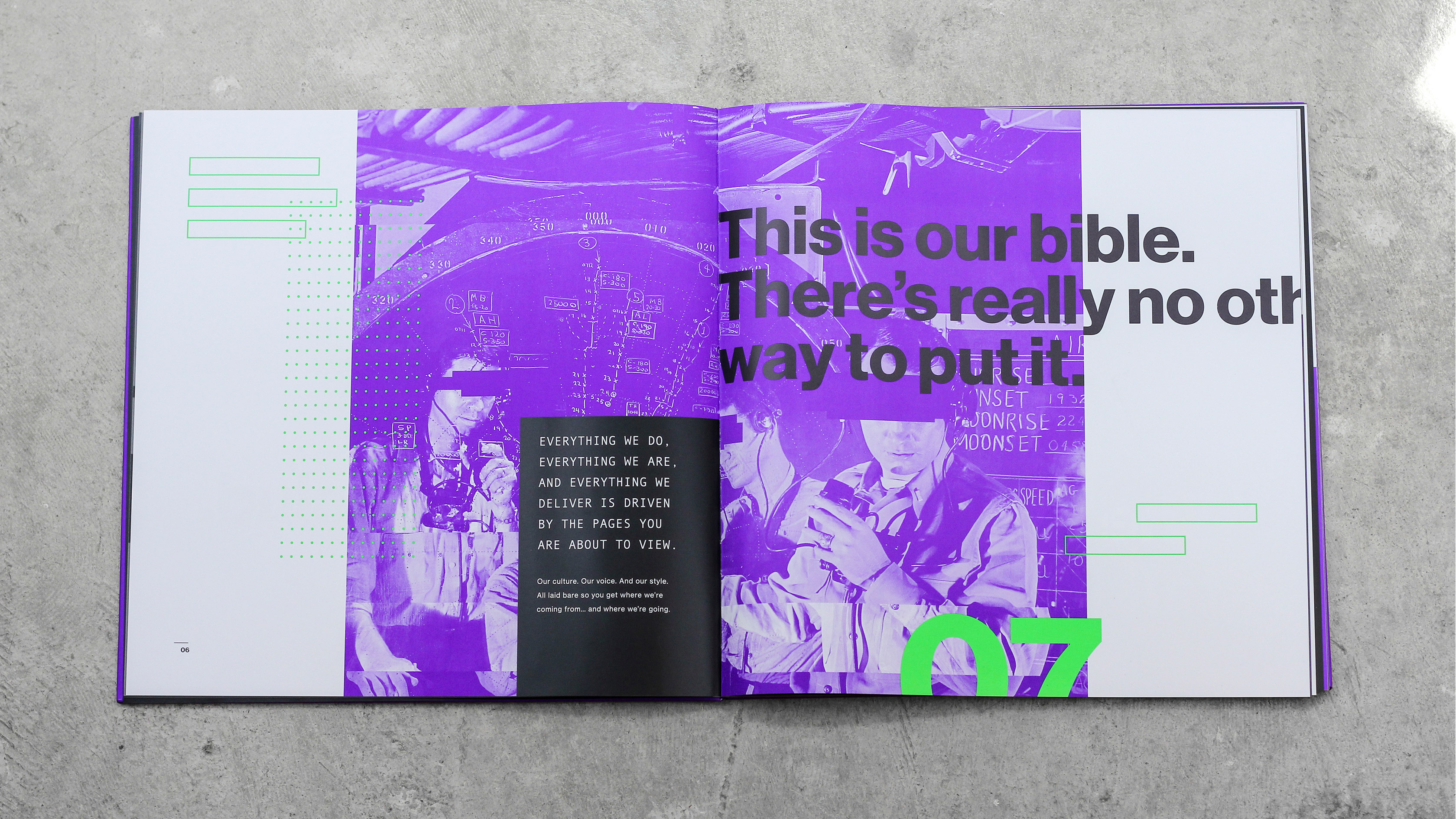
At nclud, we felt the best way to make this change permanent for all to see was to establish a brand bible. An actual physical reference to set our parameters and guidelines. We set out to create not only an internal reference for how we would discuss ourselves, but an announcement to the world that we are a provocative creative agency.
Our team assembled in the conference room, head first into feelings of nervousness, tension, and even confusion. The ever-present feeling of change was positive and exciting, but when faced with mounting obstacles we knew we had to mobilize our plan of attack. Our final goal had to accommodate the most innovative, creative, and flexible solutions possible. So it began:
We plunged into months of creative exercises to shed our old skin and unravel something profoundly unique.
The bigger picture was set, so we took to our sketchbooks to hash out the details. What followed became rounds of iterations and refinements that materialized into a bulletproof brand strategy. The rebrand process taught us a lot about who we truly are as a team. We uncovered more about the company by relentlessly plunging into presentations and harsh critiques, to then be rewarded with smart solutions and late-night sushi.
Lost in Time Like Tears in the Rain
Our research and ideation sessions lasted weeks, and during one particular white-boarding session we had a collective breakthrough. We were fueled by each other’s enthusiasm and developed a series of foundational key words for the direction of our brand. What started off as a theme of an underground society drawing inspiration from masonic symbols, quickly transformed into bright lights, neon signs, and glitch art from the tech noir scene.
Our evolving style was increasingly inspired by films like Blade Runner and Terminator; they command attention and seek to break things while reinventing technologies. We are bound together by a team of unique individuals that constantly help mold what nclud stands for and what we truly are: agents of change. We wanted our brand to be so bold and different that it would elicit crazy responses from the audience. Love us or hate us, we fought to make our mark.
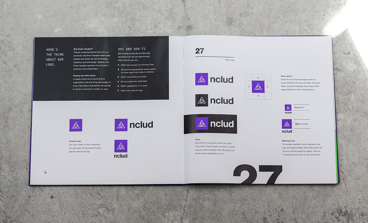
We began to notice a theme throughout the process where the logo mark took the shape of a triangle. It expanded into the sum of three parts: design, development, and user experience. The elements were refined to spin inward—a notion to our collaborative process.
nclud’s CEO, Kerry Gunther, immediately identified with this shape and pushed us to continue down this direction. We narrowed down our ideas to a final three, and after choosing the final concept we kicked off the iteration phase — which included refining the mark from everything from the stroke weights and reduction in size, to the degree of each triangle and the repetition of the triangles inside the mark.
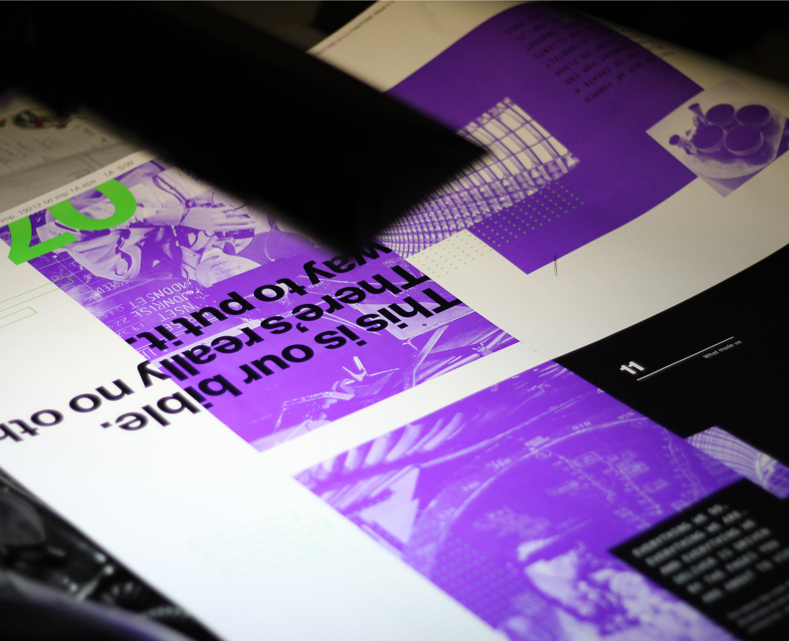
Conceptualizing the Brand Bible
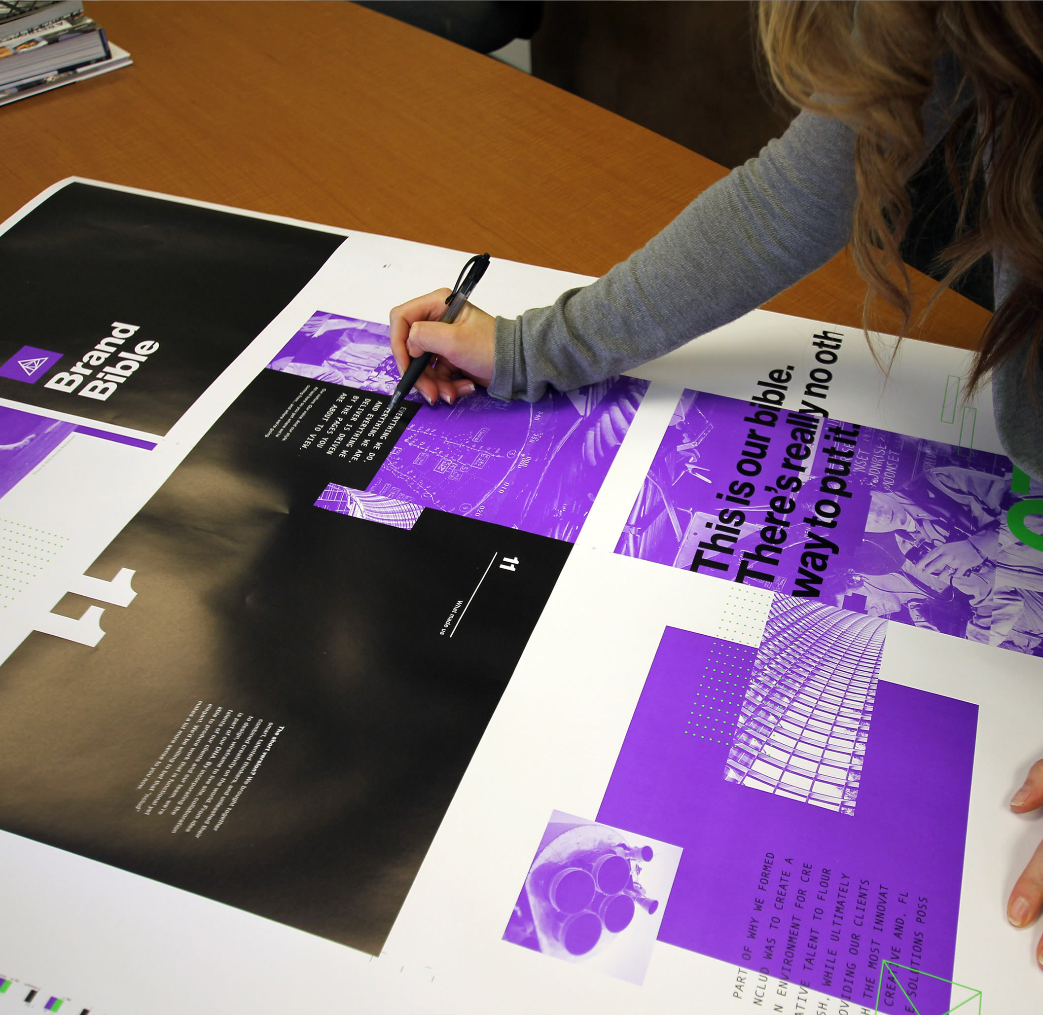
The layouts for the general flow of the book were sketched while considering many factors, such as how the typography and grid could play off one another to create the juxtaposition of our brand. Pushing words off of the page, tight grids, and purposefully broken elements were some of the first general ideas that informed the final format. Massimo Vignelli’s Swiss grid provided inspiration to use an orderly 3 columns.
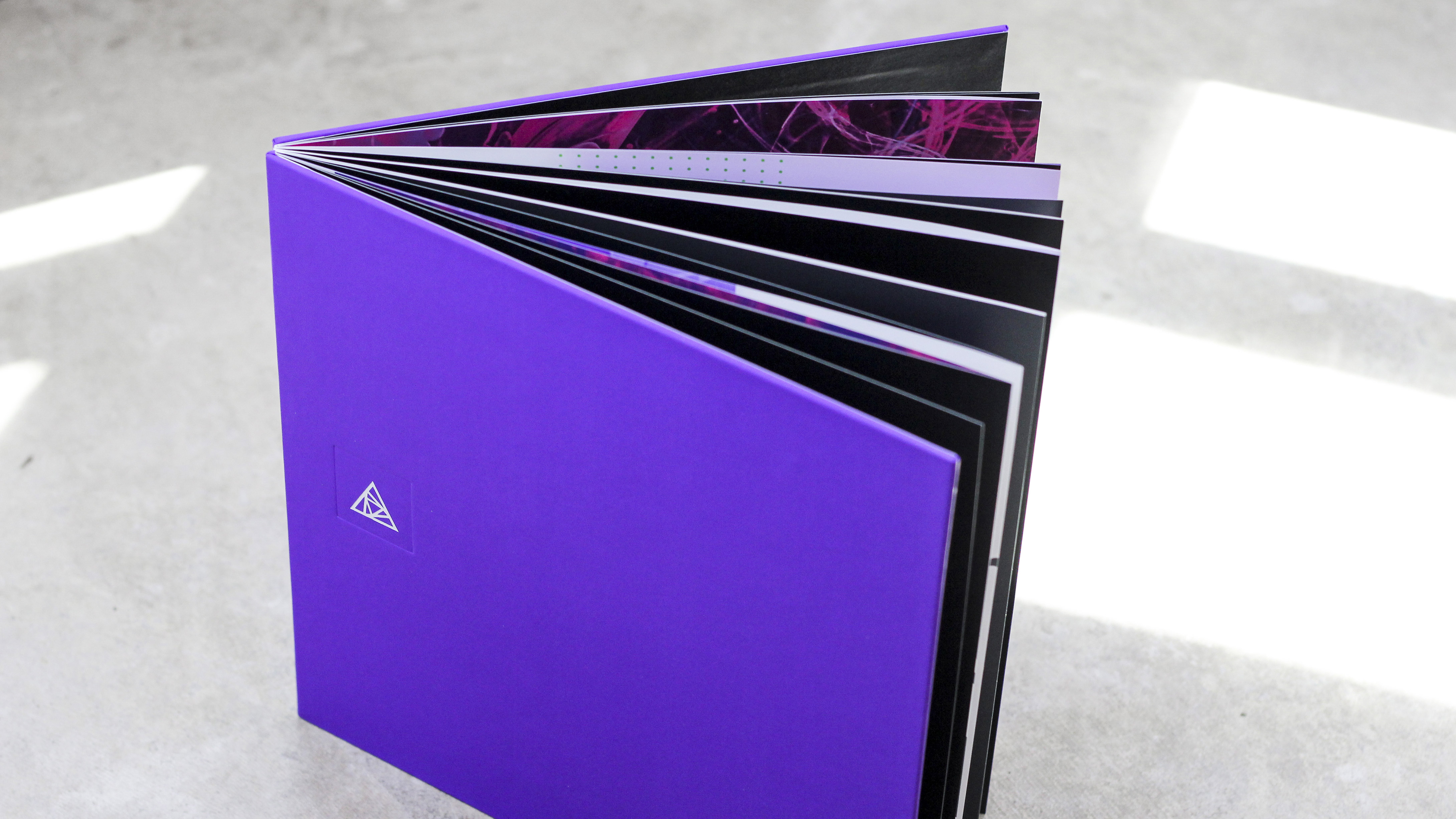
Special care was taken to construct a cadence in the type by balancing the size and leading. Experience in print design and binding techniques resulted in a cover that was created using unique varnishes and other production methods, enhancing the beauty of the entire composition.
Content was discussed and refined with our copywriter as sketches and layouts were built and designed. After rounds of layouts had been completed, we would iterate on the content in context of the design. We established our finite brand rules such as color, type usage, imagery and more during the meetings in which we refined each element as a team.
Ultraviolet Feels and Cathode Hues
nclud has been a part of the digital agency scene for some time now, having built a casual, open and friendly, and laid-back reputation. We’re always ready to lend a hand in the community, teach, and learn from our peers. We stray away from the stuffy, conventional, and conservative. Our tone of voice and collective personality grew out of these beliefs and practices, rooted in a place of confident capability, rather than cockiness or condescension. That being said, we’re staunch defenders of our work and the strategy that informs it. We are firm in our convictions and confident in our skills.
We’re smart, but not smart-asses. It didn’t take us long to verbalize this, as it was inherently the nature of our company.
When addressing tone and written language, we agreed to be efficient with our words in every form of communication. We speak plainly, simply, and with purpose, but that’s not to say we aren’t willing dig deeper into the thesaurus for a better way of saying things (i.e. “awesome” becomes “astounding”; “different” becomes “unique”). We prefer short, bold statements. Some call it “punchy,” or “ staccato.” If it can be said in twelve words, we’ll say it in five.
After our writing style was developed, we revisited our logo mark to determine a strict set of use cases. The triangle should never be applied without the solid box behind it; the disparate spacing and brightness of the color provoke an intended discomfort, calculated idiosyncrasy, and welcomed imperfection. We took special care in allotting adequate space to protect the height of the triangle, as well as minimum sizes for print and digital use cases. The mark should stand alone as a strong attribution to the greater branding system. Knowing that there are cases in which we must display our company name clearly, we created a series of vertical and horizontal typographic adaptations. Whether it’s displayed in black and white or inversions of the predetermined brand colors, each variant serves a purpose.
Our typographic system was developed with the goal of making a loud tribute to typographic history, adorned with off-kilter subtleties. It takes a second look to peel back the exterior and uncover the radical statements that our brand has written. It may look familiar, because it is—Neue Haas Grotesk is often mistaken for its descendent, Helvetica. It’s an intended effect to show that we are calling towards our roots, but we’re simultaneously asking our audience to take a second look. With smooth lines and a semblance created by hand, Neue Haas Grotesk had that rich typographic character that we sought after.
This felt right for our brand as a familiar entrance into our jarring messages. We chose Andale Mono for the subhead type, which was first distributed as an add-on for Internet Explorer 4.0 and one of the first non-system fonts intended for use on the Internet. It contrasts perfectly with Neue Haas to give typographic compositions a tech noir, analog-computer personality. We continued to experiment with type and invented rules for the monospace font to break characters on purpose and run bold headlines off of the page. Like sticking your head into the lion’s mouth, our viewers are tempted to challenge what they believe to be true. We broke conventional design rules and continually pushed our conceptual idea further with typography.
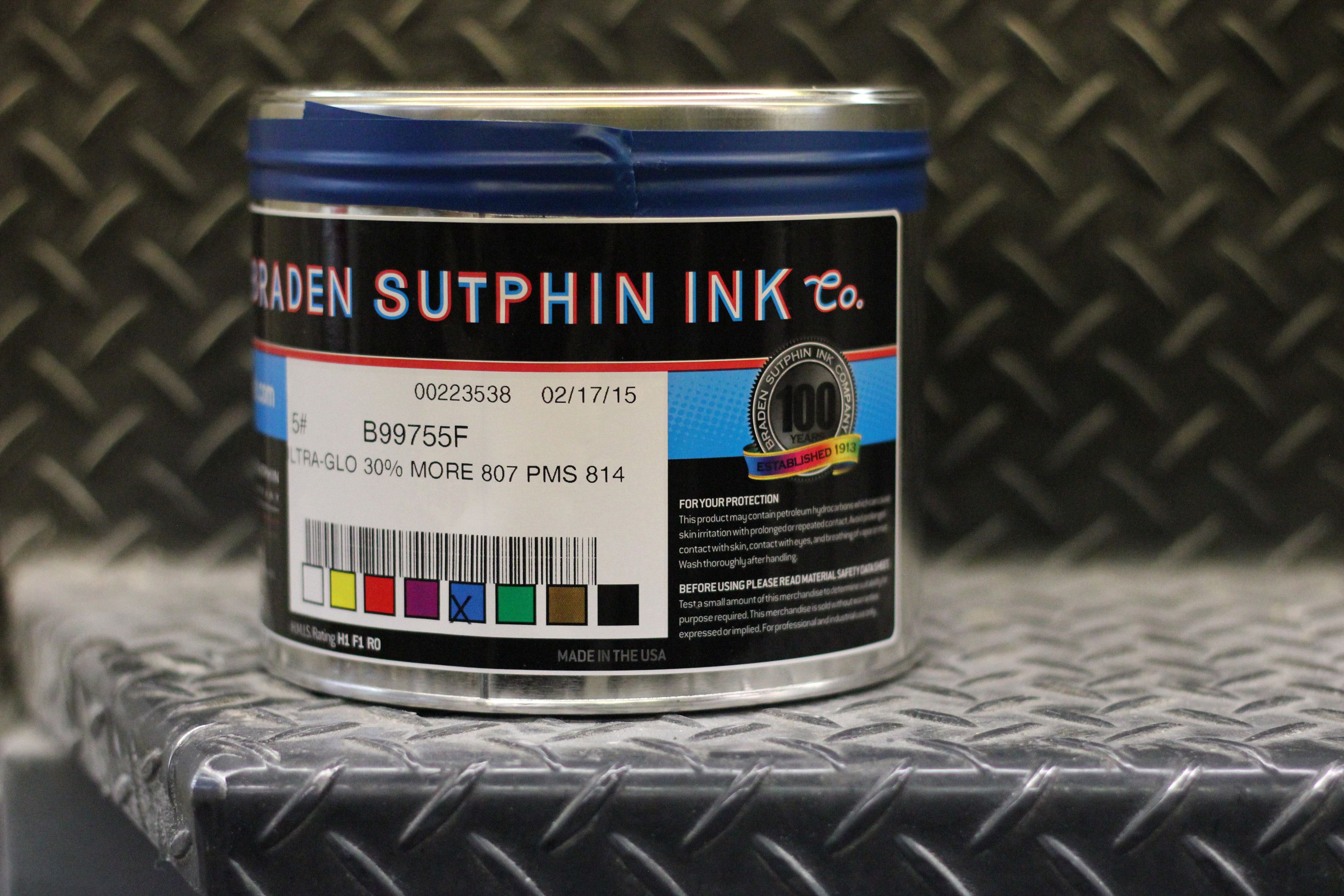
Our color choices weren’t made lightly. They had to be bold. They had to be unique. They had to stand apart from our competitors, and they had to have a reason to exist. The purple and green exhibit vibrance and life, qualities that provide a real-world representation of how our team works best. To the likes of a parent naming their child, we call the primary radiant purple “Ultraviolet” and the accents of electric green go by the name “Cathode.” It originates from the C in CRT – the original type of green-on-black displays used in the early days of computers.
Our brand’s stylistic imagery exudes elements of future noir; neon-lit skyscrapers towering over dark streets and high-contrast color washes generate imagery that deliberately defaces the handshakes and conference rooms often found in stock photography. The system seeks any attempt to induce a visceral reaction.
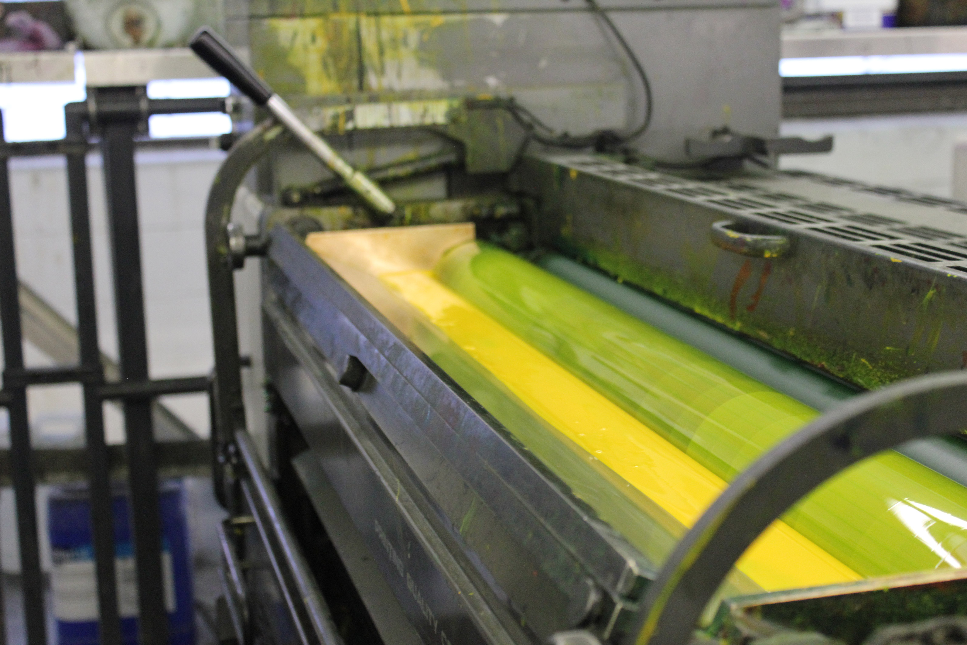
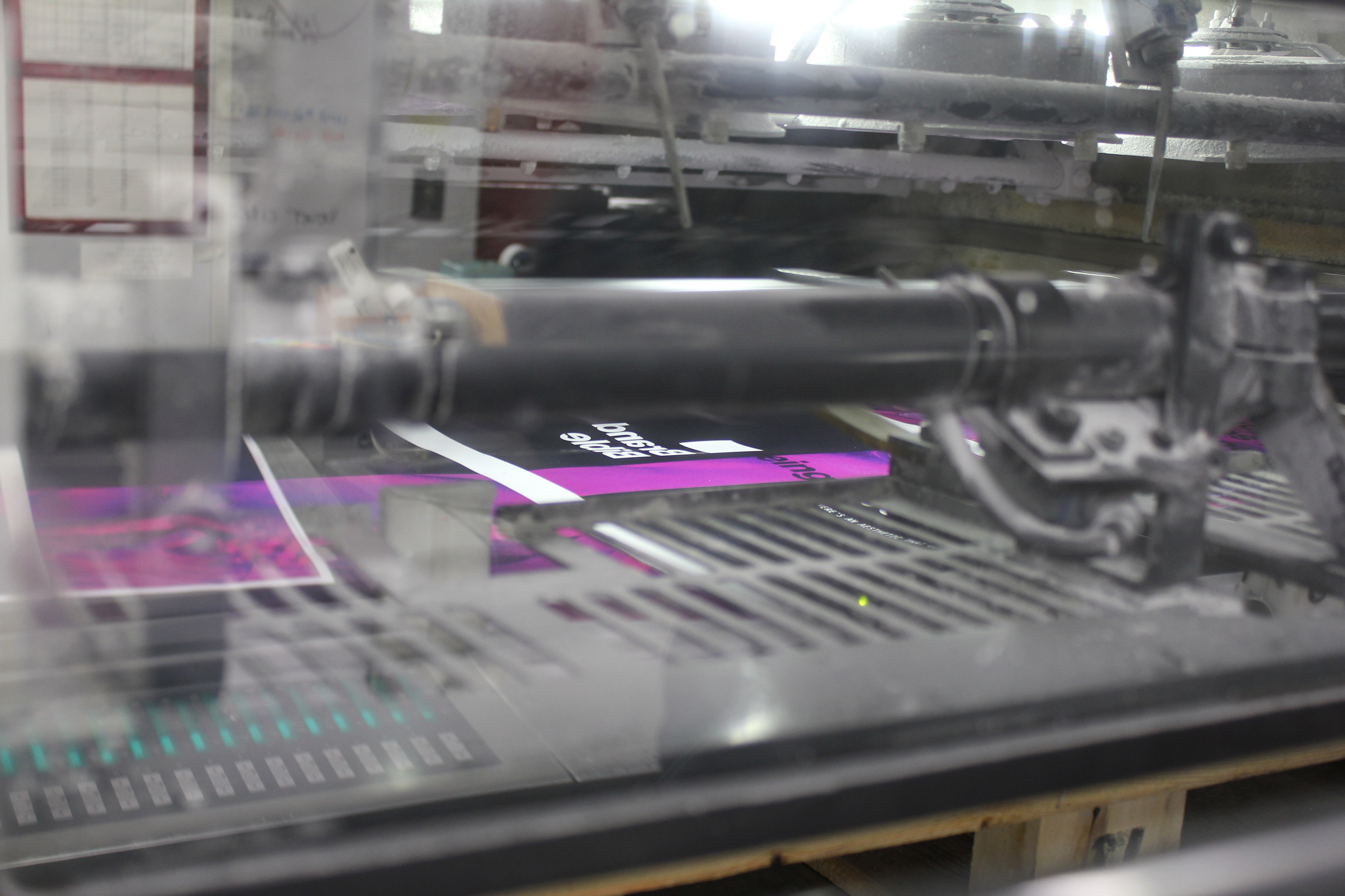
We were fully prepared to deal with the trials and tribulations of printing these fastidious neon hues. The process was grueling, but we stood by our conviction that pre-existing Pantones simply would not fit. Our partners at a print shop in Maryland guided us in mixing a custom neon Pantone that had never been seen prior to the creation of the Brand Bible. Nailing down our custom colors was an emotional rollercoaster; while the green came as easy as a Sunday morning, the purple gave us more headaches than we could count. Typical hues of purple amounted to an unflattering “Barney” shade, lacking the brightness of the desired neons we saw on our screens. The printer worked tirelessly to develop a custom shade of Ultraviolet, a combination of neon orange, magenta and a base of PMS 814c. The prize was an electric purple that would surely be seen from far-off distances.
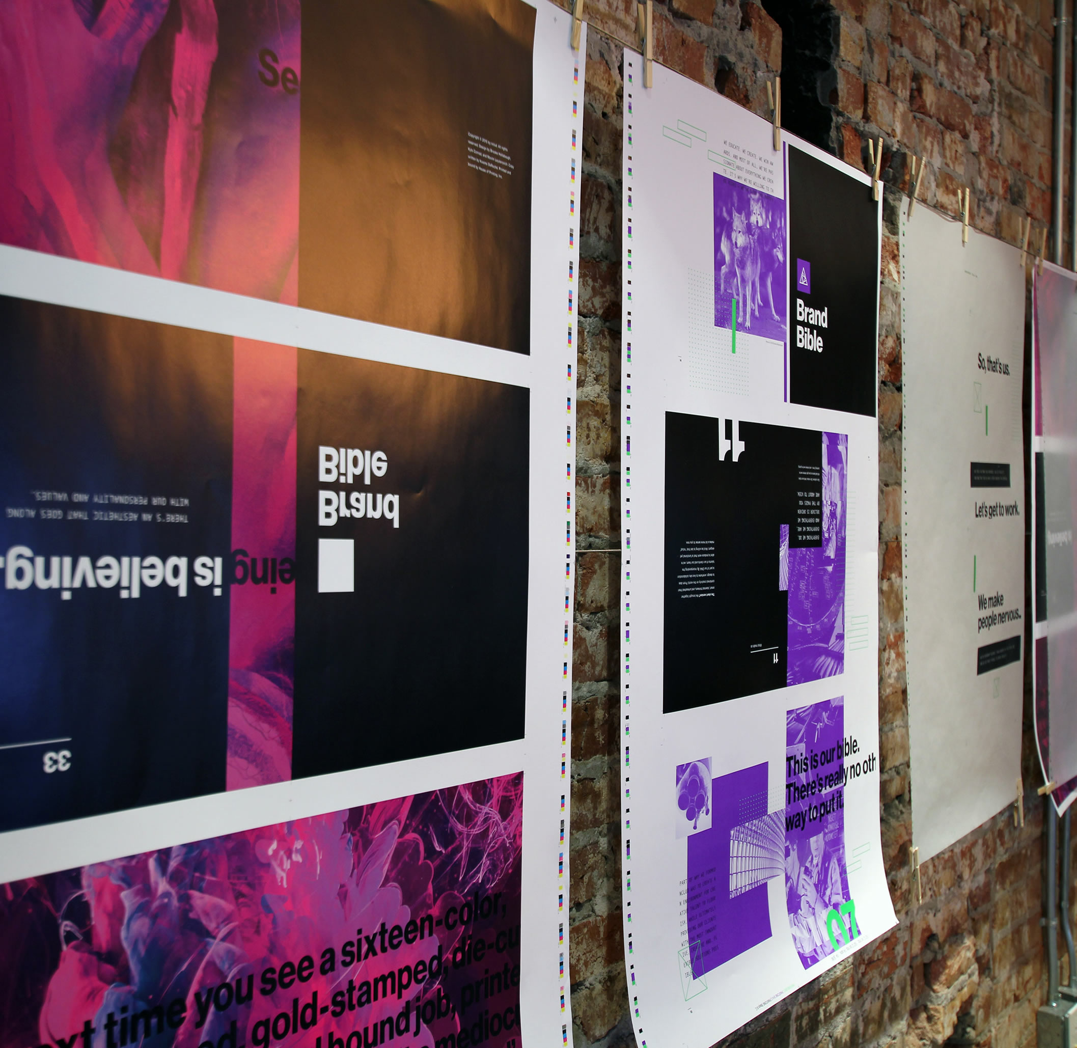
The final printing process required a sense of decisiveness not suited for the faint of heart. The possibilities seemed endless when viewing ripped plates, selecting and approving paper samples, choosing vellum, and exploring smyth sewn case binding. As the ink rolled through the presses for its final run, we knew we created something special.
The End is the Beginning
Holding the final product in our hands was a surreal experience. After waiting patiently for months while our book was being hand-bound by a vendor in Tennessee, the wait was finally over. We successfully redefined who we are without losing sight of who we were. The subsequent brand system fits all of our internal and client needs beautifully and efficiently, thanks to the steadfast collaboration of the entire team. However, as anyone who has embarked on a similar challenge knows, our work is far from finished.
During the process of chipping away and cleaning up these general themes, we felt nervous and exposed. Those feelings, in addition to experience and collaboration, are what lead us to our best decisions. That is why we make people nervous. Revolutionary is our baseline. Different is our first step. And radical means we’re just getting started.