Wingate Hughes is an established architecture firm that has transformed commercial spaces for companies such as 1776, LivingSocial, and the home office for the rarest Hot Wheels collection. Over the years, the D.C. firm has witnessed exponential growth in business through close collaboration, charismatic creativity, and relationship-driven design.
However, the company felt that their brand didn’t represent the charisma their firm valued: it was old, generic, and lacked the excitement that their business often created with their customers.
![]()
Thus, Wingate Hughes decided to partner with nclud, whose speciality in rebranding and creating digital experiences was everything the company needed to succeed in expanding their business.
Creating a Strong Foundation
We owe much of our digital heritage to traditional design. It helps keep our work honest, useful, and aesthetically pleasing down to the last detail. We uphold the basic principles of good design laid out for us by Dieter Rams because we believe that if you don’t know the rules, you can’t break them. Design is an invaluable foundation for digital and interactive experiences we seek to create.
Wingate Hughes and nclud, both creative leaders in their respective fields, recognize the importance of visual branding and the power it has over people’s perceptions. The success of a brand rests on the strength of its identity (something we intimately learned through our own rebranding process).
Thus, it was important for nclud to understand and envision the branding as well as visual style of the client before diving deeper into designing the digital experience.
Understanding Relationship-Driven Design
The first step for the design team was to cleanse the palate: to start the creative process with a genuine sense of curiosity by removing all preconceived notions of the current brand. This helped eliminate our mind’s desire of jumping into a visual direction before understanding our client’s needs fully.
We kept our core team for this project small, led by senior designers Brooke Hollabaugh and John Salmon. The process began with the team drafting a discovery brief tailored for the client to dig down to their core tenants as a business and where it was going. Hard questions must be answered, such as:
- Why does your company exist? How do you stand out in your industry?
- What are your strengths compared to your competitors? Your weaknesses?
- What are your business goals with this rebrand? How will it increase your equity?
- What kind of changes could you be making with the company in the next couple of years?
Fortunately, Wingate Hughes co-founding principals Gavin Bowie and Gavin Daniels, alongside Senior Project Designer Natalie Hnatiw, kept an open mind on our journey through the discovery process. Being an architecture firm, they gravitated towards the creative process with bravado and candidly discussed their creative vision for the logo.
They gave us their immediate requirements:
- Wingate Hughes was fundamentally the same company, hence the name would remain (but could be given the flexibility to add or omit “Architects”).
- Required a use of bold accent color(s) to increase brand presence.
- Would like their rebrand to be scalable since their current brand was limiting in application and size.
- The rebrand should be bold and edgy…that it would create a feeling of being “punched in the face.”
- End goal was to create a clean, recognizable and future-forward solution that could elevate their brand voice.
Their slogan, “Relationship-Driven Design,” was also critical to the rebrand success, as it perfectly described the company’s philosophy and how they collaborate with their clients. The belief that client relations was all about building relationships through trust was something that needed to be conveyed in the design. We at nclud believe in this same philosophy, getting them involved in sketching, but guiding them in the decision making process.
Relationship-Driven Design was critical to the rebrand success, as it perfectly described the company’s philosophy and how they relate to their clients.
Idea Dumps & Narrowing Down Concepts
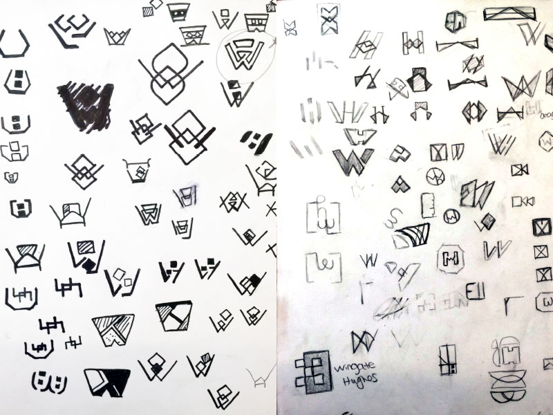
After the initial kickoff, the team kicked off the process with an idea dump and white-boarding session. Separately, a range of concepts were formulated and immediately sketched out on paper. We strove to get all of our ideas out on paper, uninhibited from judgement or embarrassment of our eccentricities impeding the workflow of our ideas.
From there, the team converged into one direction after critiquing the strongest of concepts.
“In my experience, branding work has the most risk factors to derailing a project: you can deliver countless options and have to iterate on dozens of concepts if you’re not careful to guide the process,” John explains.
Thus, the process was established to show all concepts and sketches to the client, explain the narrative of each concept, and let the client narrow down the options.
…branding work has the most risk factors to derailing a project: you can deliver countless options and have to iterate on dozens of concepts…
Brooke also noted that the team took a unique approach when it came to designing for Wingate Hughes. “Normally, we show off our initial drafts in sharpie or black and white…to help our clients focus on the impact of the mark and its readability. However, the tight timeline and the ominpresent feeling of our own rebrand posed a threat to the timeline, pushing us to turnover concepts faster than usual. Both Gavin’s were automatically keen on using pink with greys, blacks, and whites.” So, the design team decided to try out some shades of pink in the first draft to see if it could be applied directly to the logo.
The Initial Draft
For John’s direction, he explored various style treatments before settling down on the narrative of the Golden Ratio, a mathematical formula that has been used to analyze the harmonious proportions of natural and artificial objects. Combining the desire for something “easy and simple” John played with the concept of different elements (type and shape) and their symbiotic relationship with space and size.
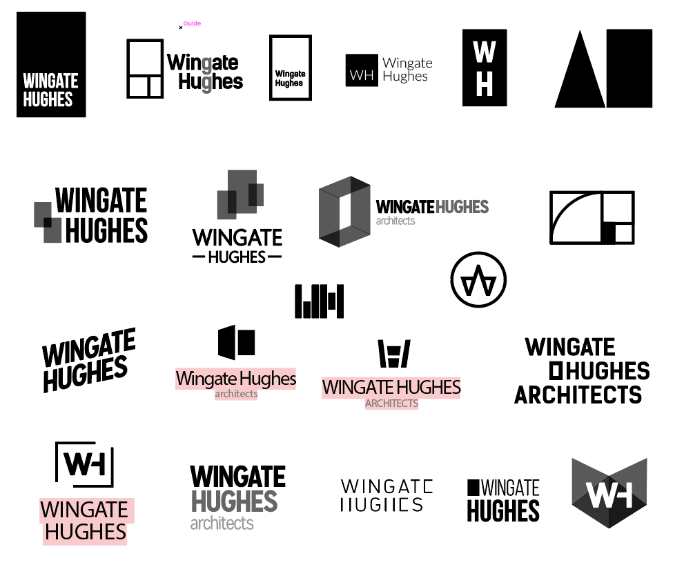
For Brooke, exploring the conceptual idea of origami by using thin strokes and varying angles to resonate with the architectural world. By interchanging the letter forms W and H into angular or curved dynamic shapes, it created interesting possibilities for negative space.
Pink With A Little Floyd
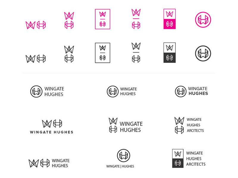
It was established that electric pink probably wouldn’t be a part of the logo during the initial deliverables, but it was still beneficial to iterate on different shades during the logo creation process to flush out potential solutions.
When walking into the Wingate Hughes office, you can’t help but notice their love of neutral greys with accents of pink and tactile surfaces. When one invests a lot of energy and time into their office space, it is easy to grasp that their physical space is an extension of their brand.
When one invests a lot of energy and time into their office space, it is easy to grasp that their physical space is an extension of their brand.
This helped inform the discovery process of pinks. We tried out shades all over the spectrum, from a deep and moody magenta to a bright and bubbly coral.
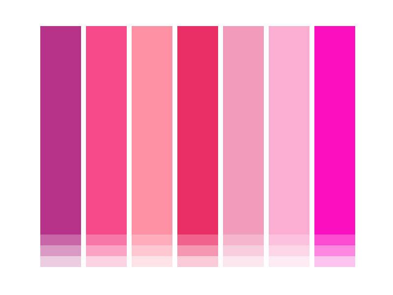
Upon countless iterations of using different RGB models of pink, the design team ultimately chose a variant of electric hot pink. It embodied a bright tone that strayed into red and matched the rhythmic tune of rock-and-roll. It held up seamlessly in print and digital application and would look great applied to their office interior.
Evolution vs Revolution
It was a grueling and passionate debate of deciding what direction best embodied the company. Should they go for the familiar square Golden-ratio approach? Or embrace something completely different?
Ultimately, Wingate Hughes felt that the brand needed a drastically new direction and felt that John’s concept was more evolution than revolution.
Brooke’s direction was unique with its varying strokes and dynamic shapes that created a unique silhouette. It was a stark contrast from their competitor’s branding, enabling Wingate Hughes to stand out from the usual minimalist, clean approach.
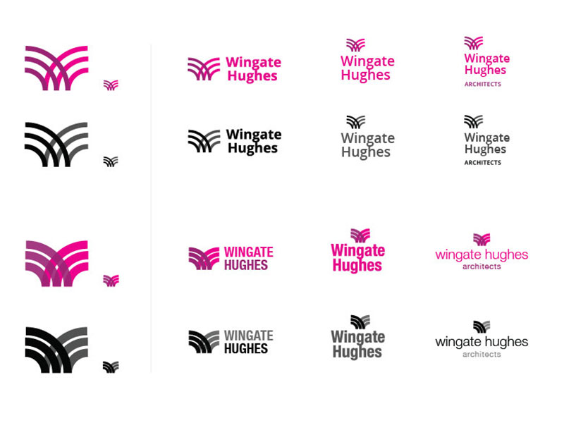
Tweak and Peak
Once we had our final direction in tow, it was all about finessing the logomark. The mark heavily depended on the stroke value, so it was all about trying out various point stroke sizes.
While thin strokes (1pt) had an intriguingly complex quality, it caused issues with readability at certain sizes with presenting the mark at sizes roughly 200px or smaller. The delicate strokes also seemed too familiar to other leaders in their space, so by boldening it with 5pt stroke helped with contrast at smaller sizes and created a distinct mark lending itself to the use of negative space.
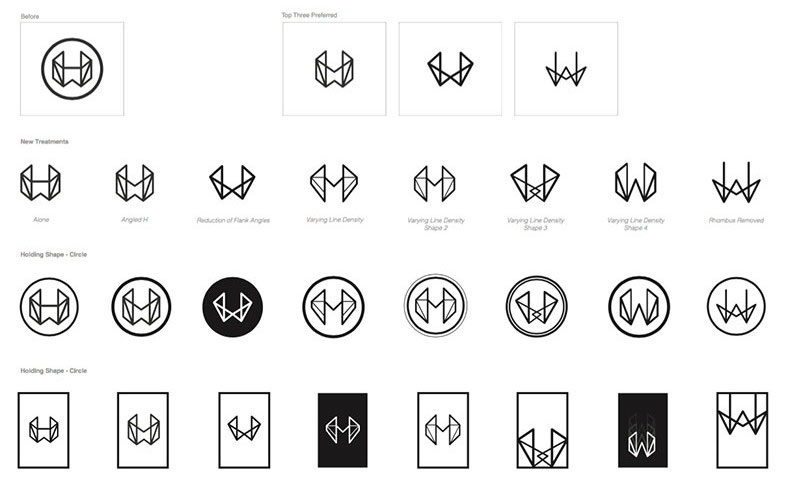
Tweaking the angle of the “W” diagonal stroke was also critical to the logo’s success. If the mark was off by only a couple of degrees, the W would disrupt the negative space and the H quickly become lost.
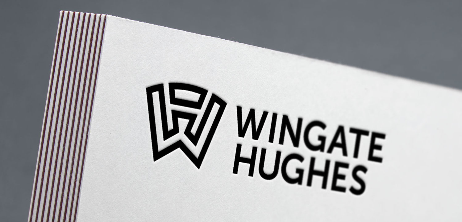
Countless iterations were made with very subtle differences and presented on a day-by-day basis. Finally, after being tested at various sizes for scalability, given different color treatments, and fine-tuning the negative space, the final logo was delivered.
Futura-Forward
As for the typography, we felt that the logomark was strong in presence, so it felt necessary to choose a typeface that was, “simple, versatile, non-decorative.”
The design team felt it was appropriate to find a geometric type solution to pair with the logomark. A clean san-serif typeface was the best option for readability and contrast with the mark.
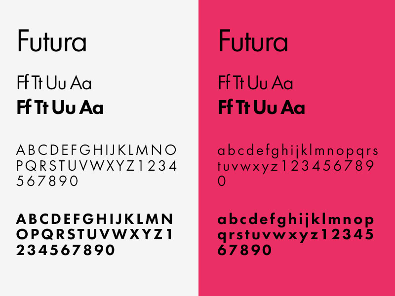
Futura was a perfect match. Not only does the typeface derive from the art style Bauhaus (and as one knows, was a pivotal influence in modern architecture), the letter’s use of near-even weight was principal in our creation of the logomark’s structure.
Business Cards and Ninja Grappling Hooks
The brand refresh was exactly what Wingate Hughes was looking for: a memorable mark that that plays on architectural shapes with a bold command presence and reinforces the founder’s names with negative space. Furthermore, the client relations between the two firms exemplified “Relationship-Driven Design,” showing that great things derive from close, creative collaboration.
nclud’s thorough process of listening and working with our firm’s strength’s and goals led to a revolutionary rebrand for Wingate Hughes Architects. This branding is a solid reflection of our business and design philosophies.
— Gavin Hughes Daniels, Wingate Hughes Architects
From there, nclud was proud of Wingate Hughes’ enthusiasm of infusing the new branding and mark into their company culture: from ninja grappling hooks, shot glasses, to the standard business collateral, the logo was also launched alongside the company’s new website.